Capital One
Financial Services Design System Documentation Site
Due to NDA, visuals for this project (prototype, complete sitemap, component specs) can't be shared publicly.
Role: Experience Design Intern
Timeline: Jun 2025 - Aug 2025
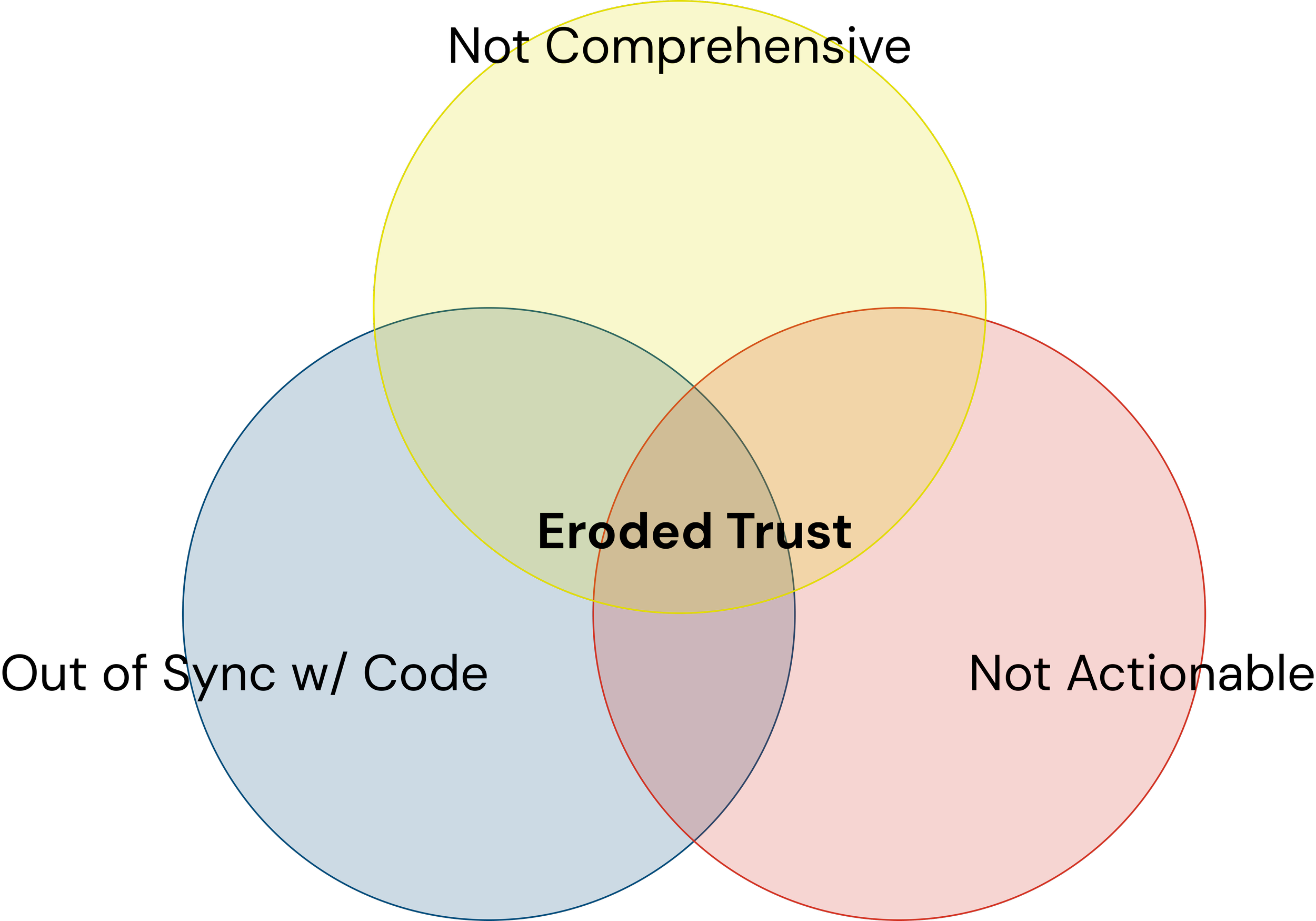
Problem: Designers and developers across FS product teams lacked a reliable way to understand and correctly implement the design system. In interviews, users described the documentation as not comprehensive enough, too high-level to be actionable, hard to navigate consistently, and frequently out of sync with what was actually shipped in code. One designer summarized the gap well: documentation needed to work for someone with mid-level system knowledge, but still be robust enough for a true beginner. This forced teams to rely on direct, repeated outreach to the Foundations team just to get basic implementation questions answered.
Context: I joined the Financial Services Foundations team, which owns and maintains the design system used across Capital One's Financial Services products. As the only intern on the team, I independently led the full research effort and built the prototype end-to-end with Figma.
Goal: Design a best-in-class documentation experience for the FSDS, grounded in industry best practices and the real needs surfaced through user research.
Research: I started with a survey sent to all FS designers, which got about 80 responses, to get a broad temperature check on where the org stood with the design system and documentation. I followed that with 13 user interviews across designers and developers to dig deeper into the patterns the survey surfaced, alongside a competitive analysis of other companies' design system documentation (including IBM's Carbon and REI's Cedar) and an audit of the team's existing resources, including their internal component library and a secondary internal tool. The research surfaced a few consistent patterns:

Component documentation existed but lacked depth. It described what a component was, not how or when to use it, leaving out things like usage guidelines, anatomy, and do's/don'ts.
Design and code were frequently out of sync, which eroded trust in the documentation as a source of truth.
An existing internal tool suffered from scope creep; it tried to serve too many functions at once and, as a result, didn't excel at any of them, leaving users with a disjointed experience.
Across the board, users wanted documentation that was easy to find, reliable, practical, and integrated directly into their workflow, rather than a separate destination they had to remember to check.
These insights pointed to two distinct problems to solve: where documentation should live, and what it needed to contain to actually be trusted and used.
Solution: I evaluated three hosting approaches against the team's actual constraints — engineering bandwidth, existing tool adoption, and budget:
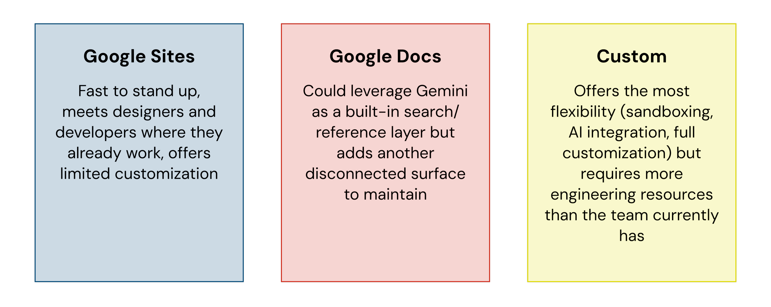
I recommended Google Sites. With limited budget and no dedicated engineering capacity for a custom build, it was the option that could realistically be implemented and maintained by the team alone. It also matched a clear pattern from the research: designers and developers were already working in Google's ecosystem, so meeting them there directly addressed the "isolated from other tools" problem identified in the audit, without requiring teams to adopt a new platform or the Foundations team to maintain content in multiple places.
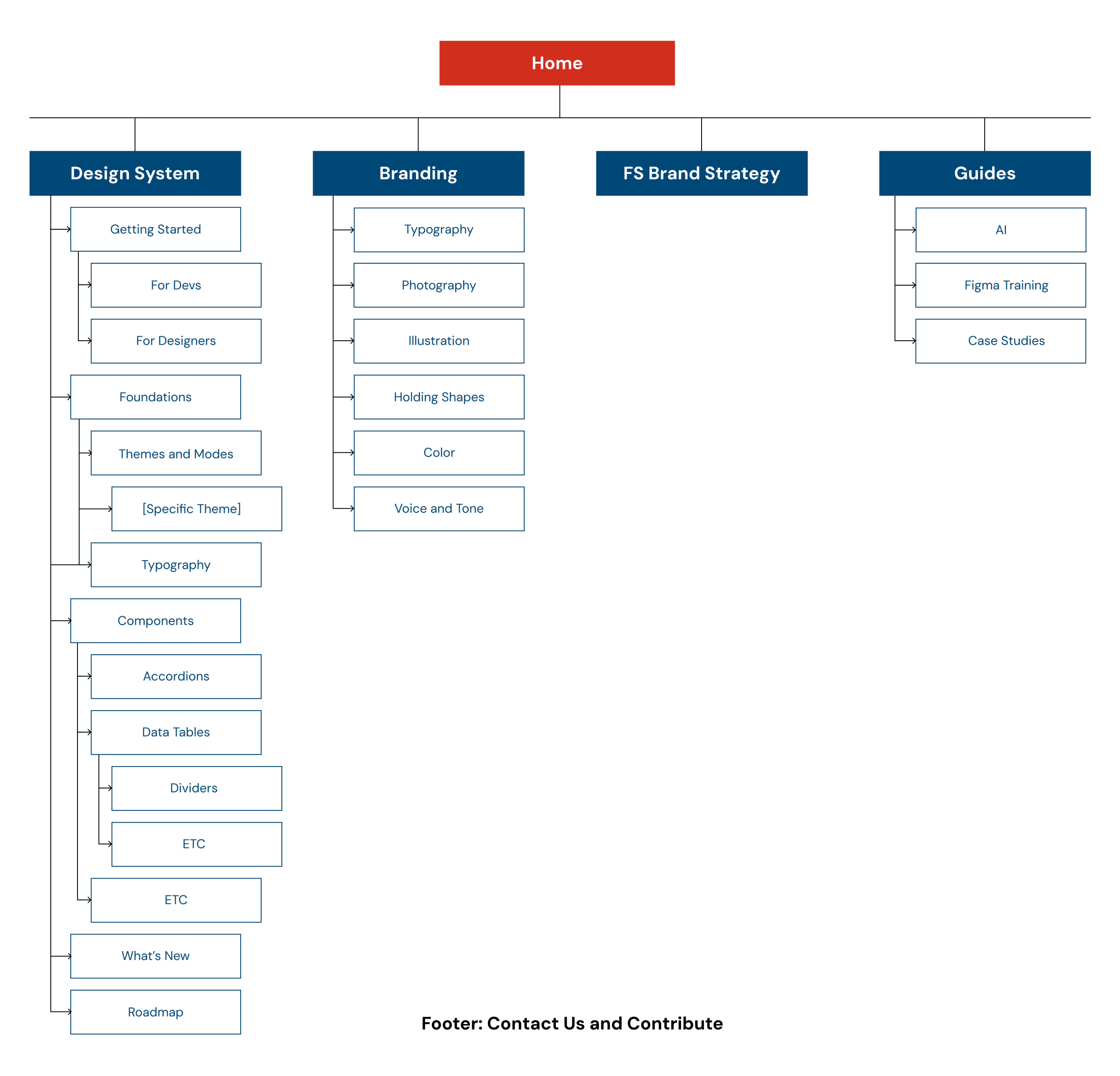
To make this actionable, I delivered a resolved sitemap that reorganized content into clear categories (Design System, Branding, FS Brand Strategy, Guides) so that foundational content, component specs, and brand guidance were no longer competing for the same navigational space. I paired this with a clickable MVP prototype to demonstrate the new structure and content approach, and a content strategy defining what each component page needed to include (context, do's and don'ts, implementation guidance, and a full showcase of variations) so documentation could finally function as a trustworthy, self-serve resource.
Alongside the hosting decision, I defined a content strategy for what each component page actually needed to contain to be trusted and used: context for when and why to use the component, do's and don'ts, implementation guidance, and a full showcase of variations. I proposed this after noticing that while it's expected and accepted for interns to ask frequent questions as they onboard, full-time designers and developers who were equally new to the system didn't have that same built-in permission to lean on the Foundations team repeatedly, which leaves them stuck without a reliable way to close the gap themselves. This directly addressed the "documentation lacked depth" pattern from research, and the approach was informed by seeing similar content strategies used effectively in other design system docsites like Carbon and Cedar.
Impact: This reframing and the content strategy approach were well received by leadership, and the Foundations team confirmed they planned to continue iterating on and implementing the sitemap, content strategy, and Google Sites direction going forward.