KIOSK
Team: 4 Designers
Timeline: Jan 2025 - March 2025
Brief: This project was a part of DSGN 100, a prototyping class. We were told to create a digital kiosk for a location of our choosing. My team opted to make one for farmer’s markets.
Why Farmer’s Markets?: Farmer’s markets encourage healthy eating, bring community together, promote sustainability, and support local farmers. Whether it is someone’s first time attending, vs their hundredth, farmer’s markets are an exciting experience. However, they can tend to be chaotic, busy, and unorganized, which can discourage customers from shopping.
Research
Online Research: We explored how vendors and consumers engage with farmers markets and reviewed existing apps and forums addressing common pain points. Technology is increasingly used to streamline farmers market experiences, with apps focused on fresh produce access and direct farmer-to-consumer sales. Users reported five recurring challenges: unwelcoming, overcrowded atmospheres; high perceived costs compared to grocery stores; parking accessibility issues; difficulty remembering vendor names and booth locations; and confusion around product and vendor recommendations.
Field Observations: We visited three San Diego farmers markets to gather preliminary insights. Little Italy presented parking challenges, random vendor organization, large crowds, and inconsistent signage. Ocean Beach was similarly crowded with a narrow single-lane layout. La Jolla stood out with a single entry point, clear sections for artisans, farmers, and food vendors, a more spacious layout, and dedicated seating — suggesting that intentional organization significantly improves the experience.
Interviews: Using storyboards as prompts, we interviewed 5 market attendees, 1 organizer, and 1 manager across Ocean Beach, La Jolla, and UCSD markets. Key findings validated our kiosk direction: 4/5 attendees reported difficulty navigating markets, and 3/3 were frustrated when vendors moved spots between visits. Both organizers noted frequent vendor logistics issues and expressed strong interest in a mall-style kiosk with check-ins, maps, and filters. Core needs included real-time vendor availability, location tracking, entry-point information, and practical reminders — confirming demand for a centralized, on-site kiosk.
Wireframing
Wireframes: These wireframes represent three core components of our prototype—the search functionality, interactive map, and rental bag feature. They were developed based on user flows we created and the sentence ideation process to ensure a seamless and intuitive user experience.
Prototype Testing: The prototype tested well overall. Users navigated confidently with minimal guidance, responding positively to the clear onboarding, familiar interaction patterns, and market-aligned visual design.
Improvements made based on feedback:
Map: confusing icon and sparse labels → updated icon, added street labels and visual cues
Vendor Discovery: lack of visual context → improved vendor visualization and refined categories
Filtering: unclear "Enter to apply" behavior → implemented live filtering
Readability: dense text caused skimming → simplified content and added clearer instructions
Feedback & Flow: insufficient system responses → added feedback cues and redesigned the final step
Visual Identity
Drawing inspiration from the keywords we associated with farmer’s markets (bright, vibrant, fresh, colorful, welcoming, organic, earthy, nature, nostalgic, clean, youthful) we created our logo and brand kit for the final designs in Figma. We wanted to keep the colors and iconography simple, so that users could easily focus.
Key Features
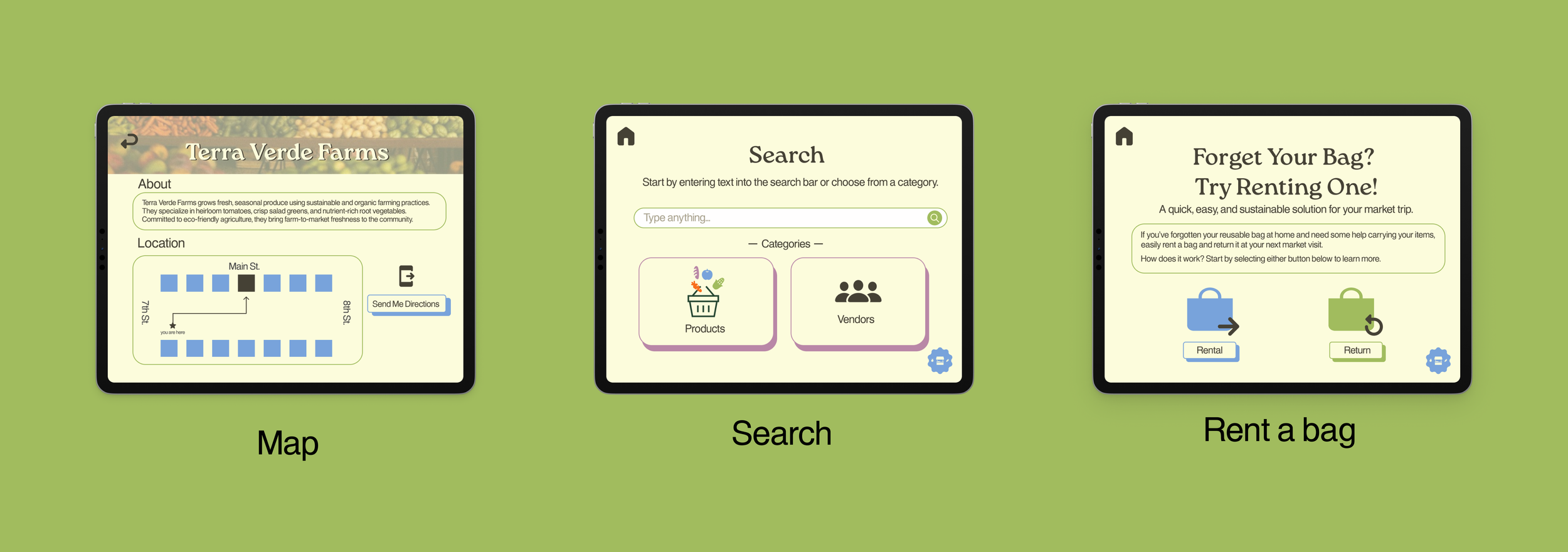
Rental Bag: We designed this feature to provide users with a convenient and reliable way to carry their groceries, especially in cases where they may have forgotten to bring their own bag—addressing a common barrier to a seamless farmers market experience.
Map: We designed this feature to help users easily locate vendors and view who is present at the market. Additionally, we labeled surrounding streets to provide directional context, making it simpler for users to navigate the market and find their desired vendors efficiently.
Search: We designed this feature to allow users to easily filter/search for specific products and vendors based on given categories. This helps streamline the market experience by enabling users to quickly find both the products and vendors that best meet their preferences.
Demo
[Click the image to start] This demo goes through the three flows of the kiosk, starting with the map, then search, and finally rental bags. For the map, the user is able to find a specific vendor on the map and text the directions to that location to their own phone. For search, the user is able to search for the vendors who sell produce and send the locations to their phone. For the rental bag, the user is able to go through the steps of renting and returning the bag. The delays on screen correspond with the Wizard of Oz prototyping done in person. The delay on the payment screen is to account for the user tapping to pay. The delay on the return/rent is to account for the kiosk identifying/ dispensing the bag.
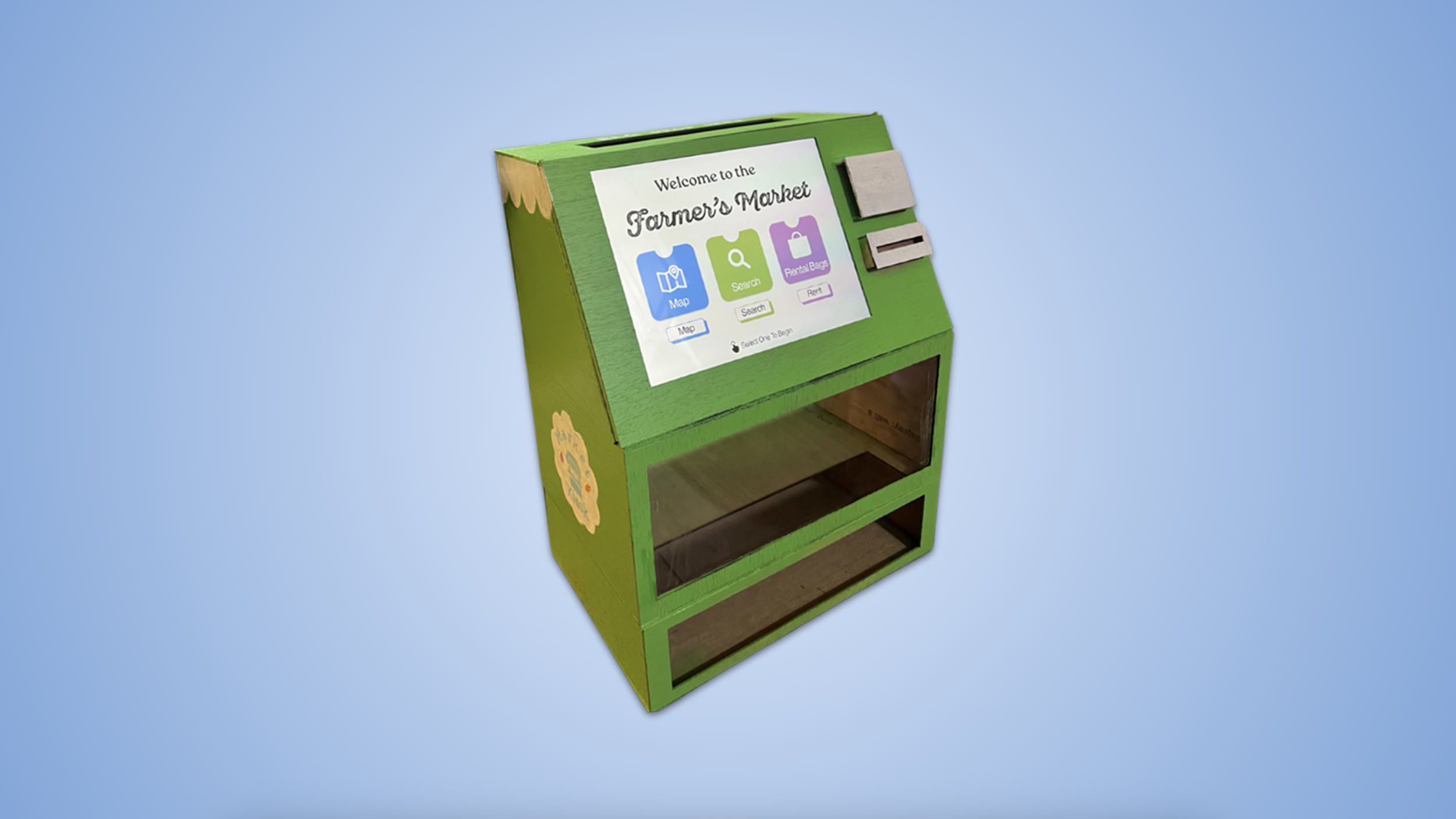
Final Kiosk
The kiosk design integrates the screen seamlessly into the structure, with a small scalloped edge detail that echoes the rooflines of market vendor stalls. A front-facing acrylic window and retrieval area serve as a "vending machine" for our bag rental system, dispensing bags using the Wizard of Oz method. Customers can return rentals through a slot located behind the screen, and pay using tap-to-pay or cash
Prototyping Process
🥡 Takeaways
My main takeaway is the value of thorough research and direct conversations with users—understanding real needs shaped every design decision. I also got the opportunity to explore physical prototyping and experimenting hands on with materials, which expanded my perspective beyond digital design.