

Farmer’s Market Kiosk
This project was a part of DSGN 100, a prototyping class. We were told to create a digital kiosk for a location of our choosing. My team opted to make one for farmer’s markets.
Team
4 designers
Timeline
Jan 2025 - Mar 2025
Tools
Figma, Inkscape, Procreate, Epilog Laser Cutter,
Skills
User research methodologies, visual design, UX design, woodworking, usability testing
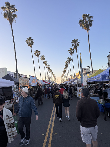
Why Farmer’s Markets?
Farmer’s markets encourage healthy eating, bring community together, promote sustainability, and support local farmers. Whether it is someone’s first time attending, vs their hundredth, farmer’s markets are an exciting experience. However, they can tend to be chaotic, busy, and unorganized, which can discourage customers from shopping.
01
Research
Online Research
We conducted in-depth online research to understand how various individuals engage with farmers markets and explored existing forums and apps designed to address common challenges associated with these experiences.
Our findings:
Technology is increasingly used to enhance farmers market experiences for both vendors and consumers
Apps aim to simplify access to fresh produce and facilitate direct sales between farmers and consumers
Users experience…
🧊 Unwelcoming atmospheres: Markets feel theme park-like, overcrowded, and cause time constraints that deter consumers
💰 Cost concerns: Users see farmers markets as pricey and less cost-effective versus grocery stores
🚙 Parking difficulties: Users find parking hard to access, especially in urban areas, leading to convenience issues
🤔 Vendor recognition issues: Users often forget vendor names or struggle to locate specific booths
❓ Confusion: Users frequently seek recommendations for vendors and specific products
Field Observations
We decided to check out some farmer’s markets in San Diego to get some preliminary insights.
Little Italy
encountered parking and traffic issues
random organization, large crowds, long lines
there were some (but not all), vendor signs at entry points

Ocean Beach
crowded, one lane layout, and lines in front of food vendors
La Jolla
this market had one entry point, and was organized into three sections: artisans, farmers, and food vendors
more spacious layout, and seating areas for market goers

Interviews
We created some storyboards to use in interviews to better understand what to include in our kiosk. We spoke to 5 attendees (Ocean Beach, La Jolla), 1 market organizer (UCSD), and 1 market manager (La Jolla).
Storyboards
Where can I shop?
Forgot a bag
Organizing vendors
Interview Findings
4/5 interviewees who were asked had somewhat/lots of difficulty when navigating a market
3/3 interviewees who were asked were frustrated when they couldn’t find a vendor at their previous spot
2/2 organizers would want to see a mall type kiosk that offers vendor check ins, filters, maps, etc
2/2 organizers said vendors often have logistical problems
Reasons for a kiosk
Difficulty navigating
Hard to find where a vendor is when they move around each time
To provide attendees with information right off the bat, filters
Help people find solutions if they forget a bag
“A vendor lineup of who's here today, who might be here next week and if it could list like the vendors websites, like a quick bio would be fantastic”
“We have people come or they're looking for a vendor who was here last week, but then they're not here this week”
Key Personas
Our key personas are attendees of farmers markets, organizers, and vendors.
02
Prototyping: Digital
User Flows
Using the key personas, we created user flows for the kiosk experiences.
Wireframes
These wireframes represent three core components of our prototype—the search functionality, interactive map, and rental bag feature. They were developed based on our user flows and sentence ideation process to ensure a seamless and intuitive user experience.
Usability Testing
We conducted usability testing on our prototype to gather feedback and identify improvements to guide our high-fidelity development.
Our findings/what we changed:
Added more feedback for users
Updated the final step to be more visually intuitive
Added clear instructions throughout (iconography)
Adjusted the available categories
Implemented a live filtering system
Improved visualization of vendors
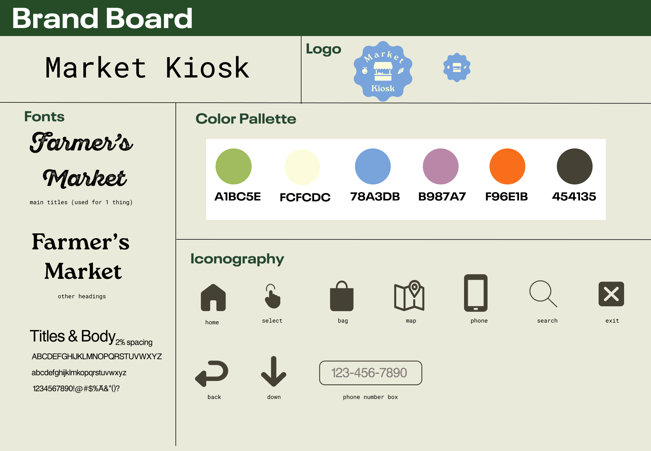
Branding
Drawing inspiration from the keywords we associated with farmer’s markets (bright, vibrant, fresh, colorful, welcoming, organic, earthy, nature, nostalgic, clean, youthful) we created our logo and brand kit for the final designs in Figma.
Hifi Screens
Key Features
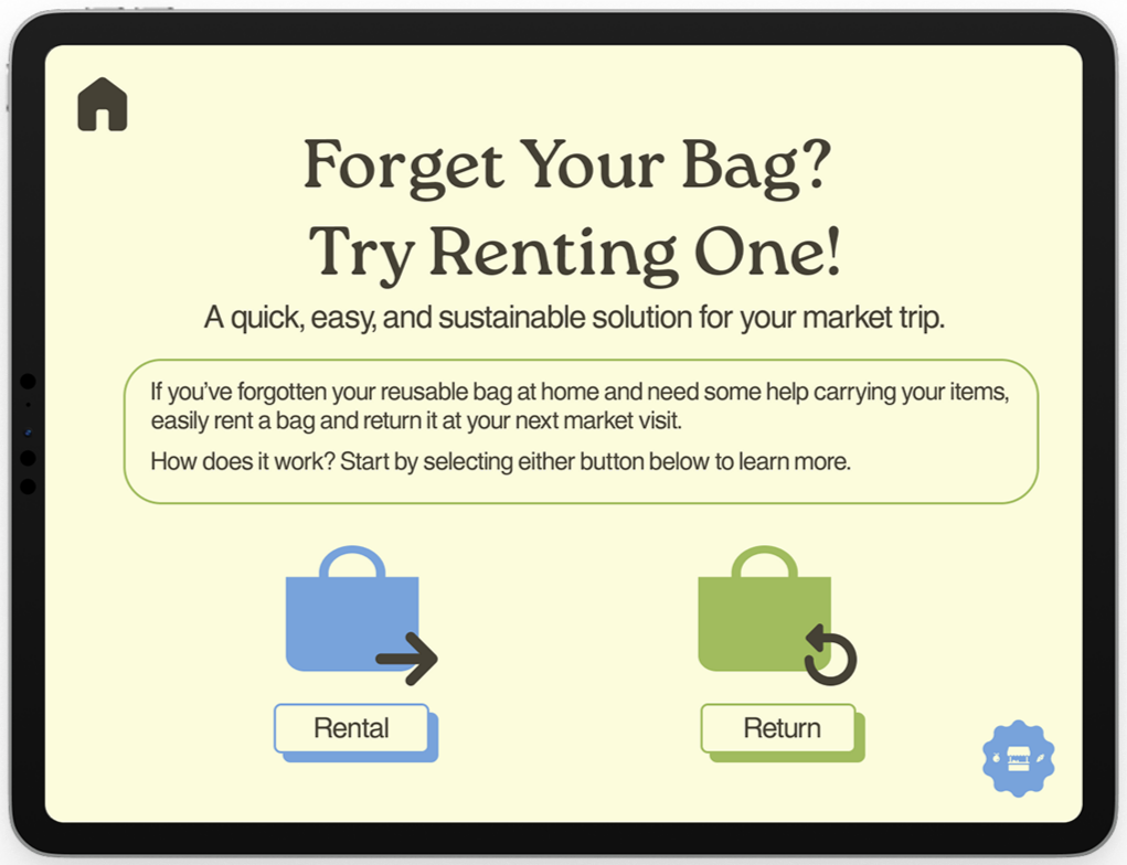
🛍️ Rental Bags
We designed this feature to provide users with a convenient and reliable way to carry their groceries, especially in cases where they may have forgotten to bring their own bag—addressing a common barrier to a seamless farmers market experience.
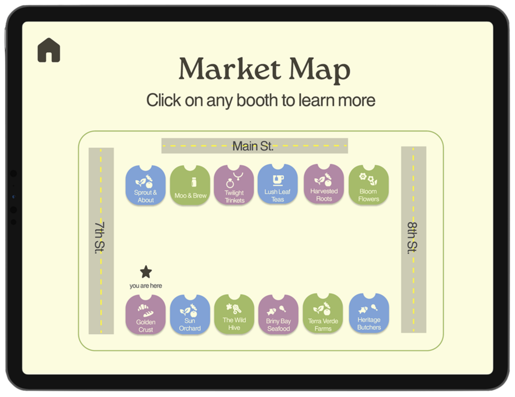
🗺️ Map
We designed this feature to help users easily locate vendors and view who is present at the market. Additionally, we labeled surrounding streets to provide directional context, making it simpler for users to navigate the market and find their desired vendors efficiently.

🔍 Search
We designed this feature to allow users to easily filter/search for specific products and vendors based on given categories. This helps streamline the market experience by enabling users to quickly find both the products and vendors that best meet their preferences.
03
Prototyping: Physical
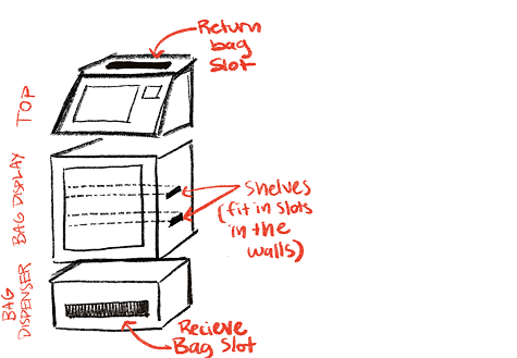
The Final Kiosk

Design Choices/Special Features
Seamlessly integrated screen
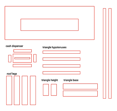
Small scalloped edge design to emulate the roofs on stands at markets
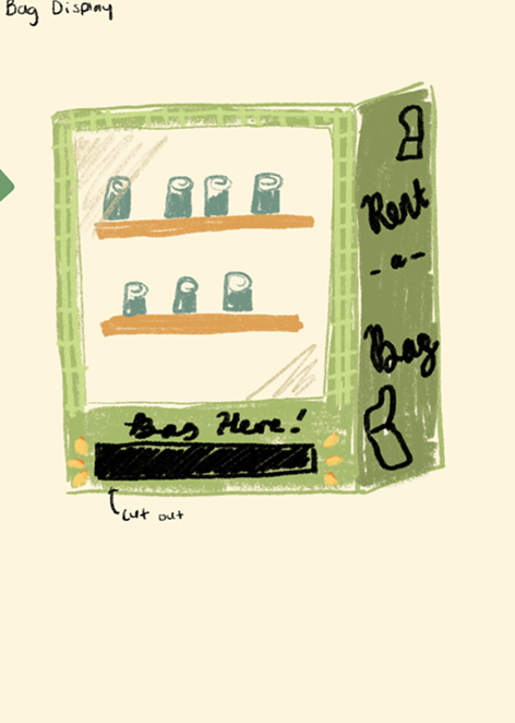
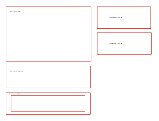
“Vending Machine”
Our bag rental system
displays and dispenses bags from the acrylic window and retrieval area (uses Wizard of Oz method)
Bag Return Slot
To return a rental bag, customers can find a return slot behind the screen
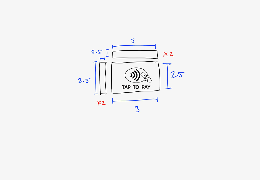
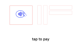
Payment Options
Customers can pay for the
rental bag using tap to pay or a cash slot
Process Work
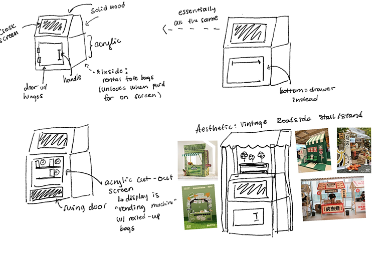
initial vision
initial vision
initial vision
initial vision
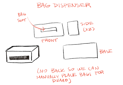
initial vision

further iteration
further iteration
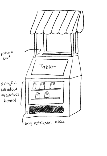
further iteration
further iteration
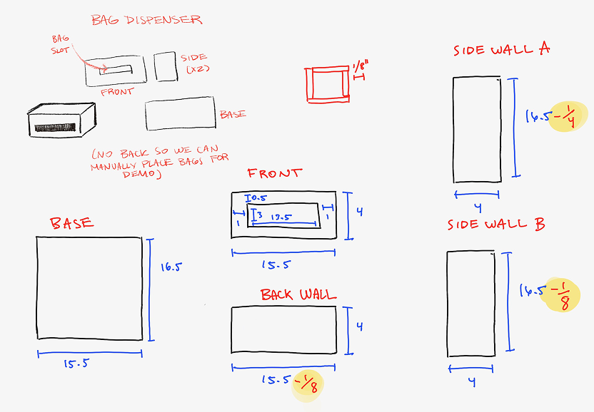
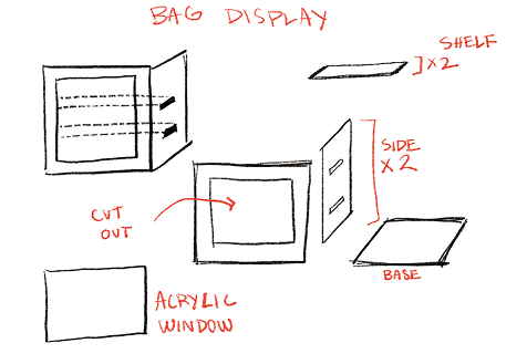
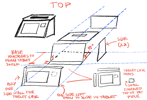
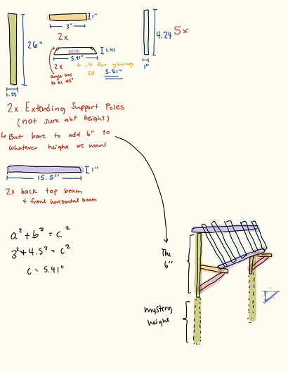
final sketches with measurements

final sketches with measurements
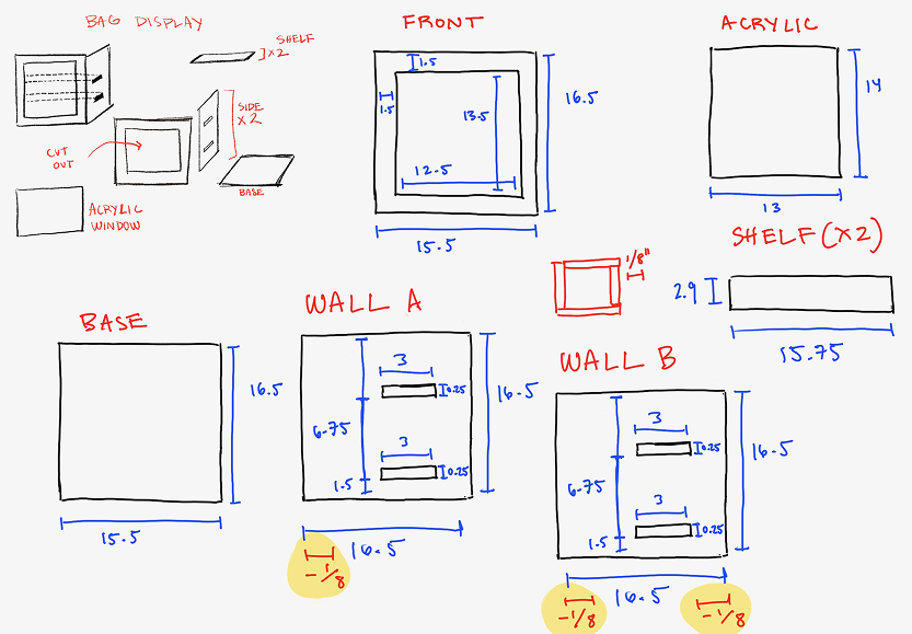
final sketches with measurements
final sketches with measurements
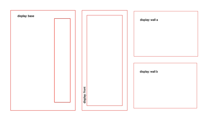
inkscape file
inkscape file
inkscape file
inkscape file
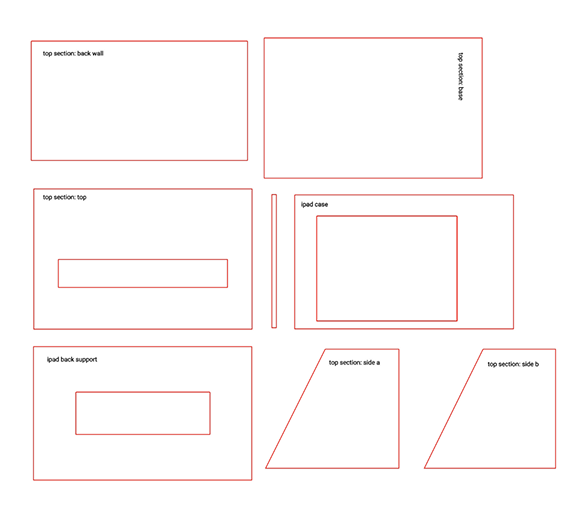
inkscape file
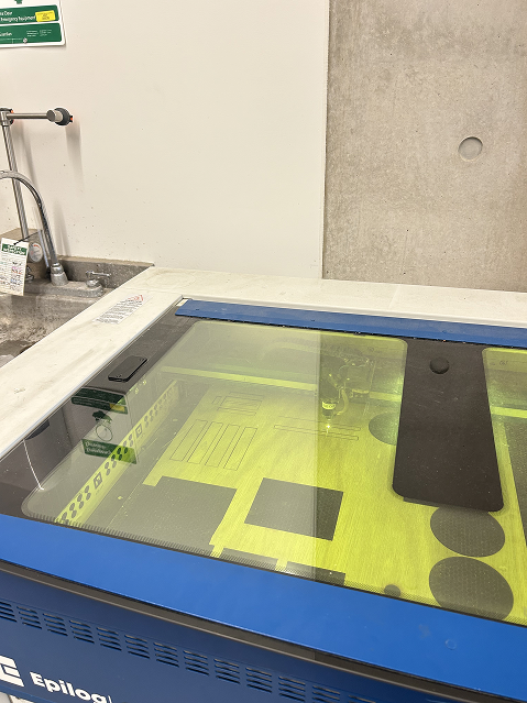
using the epilog laser cutter
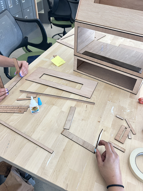
assembling the kiosk
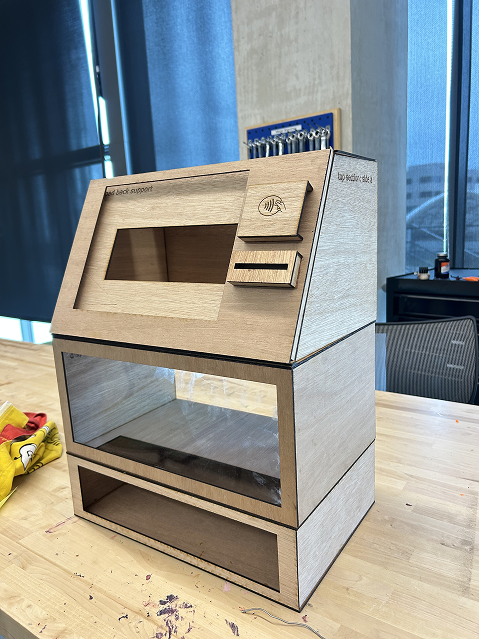
final
04
Takeaways
🗣️ The value of thorough research and direct conversations with users—understanding real needs shaped every design decision
🛠️ The opportunity to explore physical prototyping and experimenting hands on with materials expanded my perspective beyond digital design